Reveals India’s Top Manufacturers of Corrugated Boxes Packman Packaging
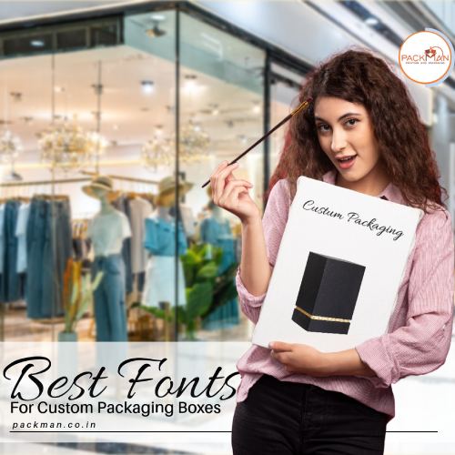
In the competitive business world, packaging goes beyond protection, becoming a crucial marketing and branding tool. Custom packaging boxes are now versatile components of the customer experience. Fonts play a pivotal role in this process, as they have the power to shape customer perceptions and convey unique brand messages. Choosing the right typeface is essential for establishing your brand’s identity

How do you choose the right font?
Packman Packaging, a renowned packaging manufacturers and supplier in India will help you make the right choice for your brand with the below-mentioned points. These are:
1) Brand Identity and Consistency
The font you choose should align seamlessly with your brand identity. Think of some of the world’s most iconic brands – their logos and packaging fonts are instantly recognizable. The font you choose for your custom packaging boxes should reflect the essence of your brand and the message you want to convey. Consistency in font usage across all your branding materials, including packaging, creates a cohesive and memorable identity for your business.
For instance, a popular beverage brand’s classic script font is an integral part of its brand identity. The font exudes a sense of nostalgia and tradition, aligning perfectly with the brand’s timeless image.
2) Font Type
Serif Fonts, such as Times New Roman, exude a sense of tradition and elegance. These fonts are commonly used in literature and convey professionalism, sophistication, and an educational tone, making them an excellent choice for luxury and classic packaging.
Sans serif fonts, like Helvetica, lack the decorative lines at letter ends, offering a modern, simple appearance. They’re excellent for contemporary, minimalist packaging, and popular in electronics and luxury brands due to their sleek, youthful, and high-end aesthetic.
Decorative fonts encompass a broad range of styles, from grunge to stencil-type texts, offering versatility in brand representation. These fonts infuse personality and uniqueness, making them perfect for themed or distinctive packaging designs.
3) Must Be Legible
Select a font for your packaging that prioritizes legibility over visual appeal. It’s important to ensure that the text is easily decipherable rather than choosing a fancy but unreadable font. Test the font with various passages to ensure consistent readability in different contexts. Ultimately, the message on your packaging, be it the product name or vital instructions, should be effortlessly understood. Choose fonts that strike a harmonious balance between aesthetics and readability.
4) Different Font Weights
When selecting a font, ensure it offers various weights like light, regular, semibold, and bold. This diverse selection enables you to establish a consistent yet distinct typographic system. For instance, use large and bold fonts for headers, semibold for subheaders, regular for body text, and lightweight options for callouts and quotes. These distinctions in font-weight help highlight and differentiate crucial information, such as using a bold, larger font for your brand name and a subtler, smaller font for product details, improving the clarity of information for your audience.
5) Flexible Fonts
Selecting a font for your packaging is a long-term commitment, particularly when ordering in bulk. Altering the font later can impact your brand’s recognition. Hence, it’s vital to choose a versatile font that can be applied across various mediums to maintain brand consistency.
Takeaway
Thus, the choice of fonts in custom packaging is a strategic decision that goes beyond aesthetics. It plays a pivotal role in defining your brand identity, conveying messages, and ensuring readability. Selecting the right font that aligns with your brand’s essence, maintains consistency, and offers flexibility is essential for a successful and memorable packaging design.


